Why AI-Generated Images Aren't Always Print-Ready — Even at 300 DPI

The hidden difference between generating an image and producing professional artwork for print.
I thought I had finished my book cover. AI had other ideas.
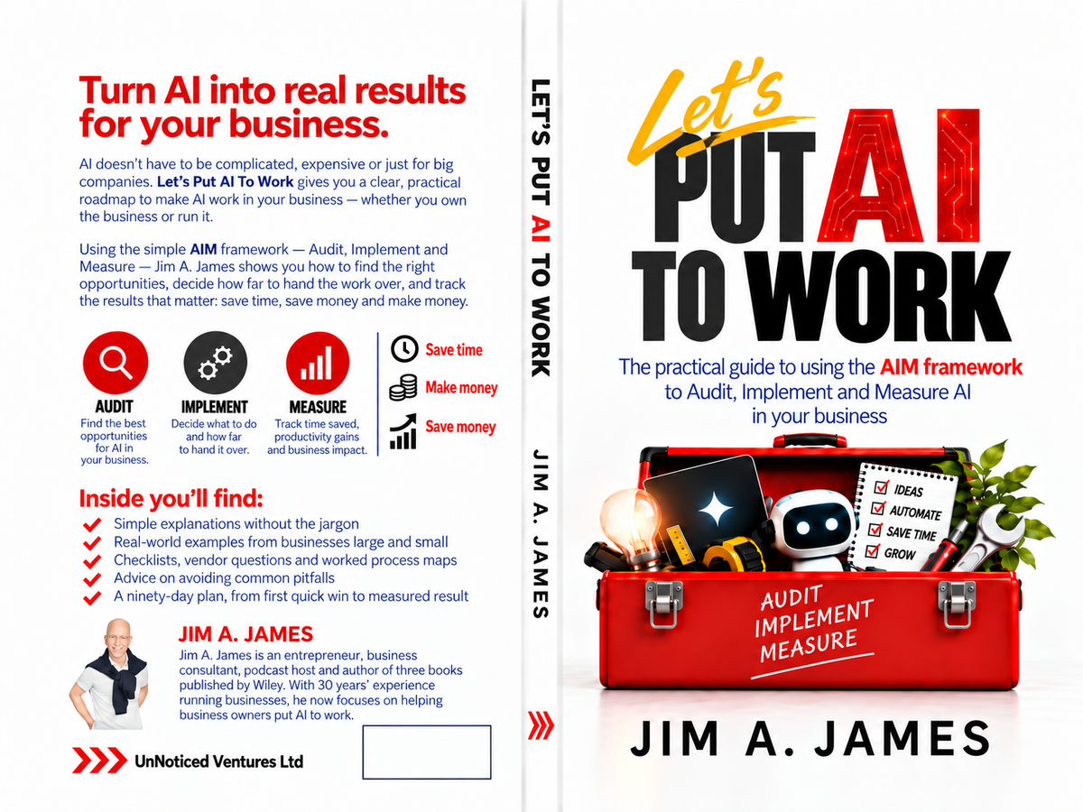
I recently completed a book called Let's Put AI To Work, a practical guide to helping business owners use artificial intelligence through my AIM framework: Audit, Implement and Measure.
Naturally, I wanted to use AI to create the cover.
After all, if I'm writing a book about putting AI to work, surely I should be putting AI to work on the book itself?
The initial results were impressive. Within minutes, AI produced a striking design featuring a red toolbox containing various symbols of artificial intelligence and business productivity. The typography was bold, the colours were right, and the concept communicated exactly what I wanted.
I had something that looked like a professionally designed book cover.
There was just one problem. Looking like a finished design and being ready for professional printing are two very different things.
What followed was a frustrating series of revisions, production errors and rejections from Amazon Kindle Direct Publishing (KDP).
And the experience exposed a fundamental limitation of generative AI that every business owner, marketer, author and designer needs to understand.
1. AI generates pixels. Professional designers build files.
When you ask an AI image generator to create a book cover, poster, brochure or advertisement, it typically produces a flattened image.
That means everything — the photograph, illustration, words, shadows, textures and background — becomes part of one image.
Imagine taking a photograph of a beautifully designed restaurant menu.
The menu might look perfect in the photograph, but you cannot simply click on a line of text and move it. You cannot change a price without modifying the underlying image. You cannot independently resize the logo.
The design has become a collection of pixels.
That's essentially what happens with many AI-generated designs.
Now compare that with working in Adobe Photoshop, Illustrator, InDesign or Canva.
In a properly constructed design, the elements can remain separate:
- Text exists as editable typography.
- Images occupy independent frames or layers.
- Logos can be vector graphics.
- Backgrounds can extend into the printer's bleed area.
- Individual objects can be moved without disturbing everything else.
This separation is fundamental to professional production.
AI image generation creates the appearance of a design. Professional design software creates a structure that can be reliably edited and manufactured.
There is an important qualification: Photoshop and Canva can also produce flattened, low-resolution files. Their advantage is not that they automatically make everything print-ready, but that they provide the tools and controls needed to prepare artwork correctly.
2. The 300 DPI illusion
One of the biggest surprises in my book-cover experience concerned resolution.
Amazon KDP recommends high-quality print images at 300 dots per inch (DPI).
My finished cover file was exported at 300 pixels per inch (PPI), the corresponding measurement for digital images.
Problem solved?
Not quite.
The original AI artwork contained substantially less detail than its enlarged export suggested. Some elements appeared to have effective resolution in the region of 180–275 DPI. The small subtitle was particularly soft.
Here's why.
Suppose an AI image generator creates a 1,024-pixel-wide image.
You can enlarge that image to 3,000 pixels wide using image-processing software.
The resulting file now contains 3,000 pixels across.
But the additional pixels have been calculated or invented from the original image. The process does not necessarily recover the fine detail that a genuinely higher-resolution original would have contained.
Modern AI upscalers can create convincing additional detail, sometimes with excellent results. But this is not the same as preserving the exact edges, shapes and lettering of professionally constructed artwork.
For photography and illustrations, the difference may be difficult to notice.
For typography, it can become obvious.
Small letters develop soft edges. Thin strokes become inconsistent. Fine details can appear distorted.
Changing an image's DPI setting does not magically increase its original detail.
That's why a file can technically measure 300 PPI and still look less sharp than expected when printed.
3. Why text is the biggest problem
Text turned out to be the most troublesome part of my cover.
The title was Let's Put AI To Work.
The design used large, bold letters, with the words arranged around the toolbox illustration.
At first glance, the lettering looked excellent.
But when Amazon rejected the cover because some text was too close to the edge, I needed to move individual words.
That should have been a straightforward adjustment.
Instead, the text was embedded in the image.
Moving the title meant attempting to erase the original lettering, reconstruct the background underneath it and introduce new lettering in a slightly different position.
The result sometimes left traces of the original text, uneven patches or visible artefacts.
We tried rebuilding the words as vector text.
Vector typography is fundamentally different from raster text.
Instead of storing letters as a collection of coloured pixels, a vector-based document preserves their mathematical outlines.
This means the letters can be scaled to almost any size without losing their sharpness.
A vector letter printed at 10 points and one printed at 100 points can both have clean edges.
But there's a catch.
Placing sharp vector lettering over an image that still contains the old, blurred lettering does not solve the problem.
You need a clean background underneath.
And that brings us back to the importance of constructing the original artwork in editable layers.
4. Printers don't care how beautiful your design looks on screen
Amazon KDP rejected my cover for a surprisingly mundane reason.
Some of the text was too close to the edges.
The rejection instructed me to move all cover text at least 0.375 inches (9.5 mm) inside the trim edges.
That's a production requirement, not a creative judgement.
A professional print file has to account for several physical realities.
Trim: The final dimensions of the printed and cut book.
Bleed: Extra artwork extending beyond the trim edge so that small cutting variations don't leave unwanted white strips.
Safe area: The region in which important text and graphics need to remain to avoid being cut off.
Spine width: The exact space available for the title and author name on the book's spine, determined by factors including the page count and paper type.
My paperback was 184 pages, with a 6 × 9-inch trim size and a spine approximately 0.4144 inches wide.
The complete cover needed to wrap around the back, spine and front of the book.
That requires precise geometry.
A word that moves a few millimetres too far might end up on the fold or outside the allowable safe area.
An AI image generator has no inherent understanding of the manufacturing tolerances of a particular printer. It may visually imitate a book cover without constructing a document that respects those tolerances.
Professional layout software, by contrast, lets the designer establish precise guides, dimensions and margins and position every element accordingly.
That is why a visually appealing AI-generated book cover may still fail a printer's technical checks.
5. The problem isn't AI creativity. It's production control.
I don't think this experience demonstrates that AI is unsuitable for design.
Quite the opposite.
AI helped me develop a compelling visual concept quickly.
It produced imagery that would previously have required considerable time, specialist skills or a design budget.
The problem arose when I tried to use the generated image as the final manufacturing file.
These are two different stages of work.
Stage one: Creative generation
AI is particularly useful for generating concepts, exploring compositions, creating illustrations, testing colour schemes and rapidly experimenting with visual directions.
Stage two: Production engineering
The final artwork must be constructed to meet the requirements of its intended destination, whether that is a book printer, packaging manufacturer, magazine publisher or commercial printing company.
That may require rebuilding typography, separating illustrations, checking resolution, setting bleed and margins, converting colour profiles and exporting to a specified PDF standard.
An AI-generated design can absolutely become professional print-ready artwork.
But generating the image is not necessarily the last step.
6. What about Photoshop and Canva?
It's worth distinguishing the tools here.
Adobe Photoshop is primarily a raster-image editor, although it can retain editable text, vector shapes, layers and other production elements.
Adobe Illustrator is designed around vector artwork.
Adobe InDesign specialises in page layout and print publishing.
Canva offers accessible layout tools, editable text, design elements and print-oriented PDF exports.
All of these can support professional print production, although their capabilities differ.
The important distinction isn't simply AI versus Adobe or Canva.
It is flattened artwork versus properly structured, editable artwork.
You could make the same mistake in Photoshop by flattening every layer too early.
And you could produce excellent print-ready artwork using AI-generated illustrations placed inside a carefully constructed Canva or InDesign document.
What matters is the production workflow.
7. Five lessons for business owners using AI to create marketing materials
My experience has changed how I think about AI-generated creative work.
First, use AI to create the visual concept, not necessarily the final production file.
Ask AI to explore the design, illustrate the idea and develop the creative direction. Then prepare the final document in software that provides reliable control over the output.
Second, keep typography separate from illustrations.
Avoid asking an image generator to bake every word into the image. Whenever possible, generate the artwork without text and add editable typography afterwards.
Third, establish production specifications before generating the design.
Whether you're creating packaging, a brochure or a book cover, know the dimensions, bleed, colour requirements, safe zones and required deliverables before work begins.
Fourth, don't confuse file dimensions with genuine image quality.
A large file or a 300-PPI export is not proof that the underlying artwork has sufficient detail for high-quality printing. Inspect the output at its intended physical size.
Fifth, budget for a production stage.
AI can significantly reduce the cost of creative exploration, but professional finishing may still require specialist software or human expertise.
The saving comes from accelerating parts of the process, not necessarily eliminating every part.
8. The wider lesson: AI needs a handover point
There is a certain irony in all this.
My book teaches business owners to use a framework called AIM: Audit, Implement and Measure.
And my struggle to produce the cover became a rather good example of why that framework matters.
I had identified an opportunity to use AI.
I had implemented the technology.
But I hadn't adequately measured whether the result met the actual requirements of the task.
I was measuring the cover against how good it looked.
Amazon was measuring it against whether it could be printed reliably.
Those are very different criteria.
The lesson extends far beyond publishing.
An AI-generated website can look impressive but contain poor-quality code.
An AI-written report can be beautifully formatted but contain factual errors.
An AI-created advertisement can be visually compelling but fail to meet a platform's technical specifications.
The same principle applies everywhere.
The output of an AI system should be judged against the requirements of the business process, not simply against how impressive it appears.
And sometimes the right decision is to hand over the final stage to a specialist tool or a specialist person.
Conclusion: AI can design the cover. It doesn't necessarily know how to print the book.
I remain enthusiastic about using AI for creative production.
It gives small businesses, independent authors and entrepreneurs access to creative capabilities that would previously have been expensive or difficult to obtain.
But there is a difference between creating something that looks finished and delivering something that is technically ready for use.
For digital graphics, the gap may be relatively small.
For physical products, printing introduces another level of precision.
My book cover was a useful reminder that AI is an extraordinarily capable creative assistant, but it isn't automatically a production engineer.
The most effective workflow combines AI's creative speed with the precision of purpose-built software and, when necessary, human expertise.
Because ultimately, the objective isn't to create an impressive image.
It's to create something that works.
And in my case, something that Amazon will actually print.
Find the Book on Amazon.
 Jim James (Author) Format: Kindle Edition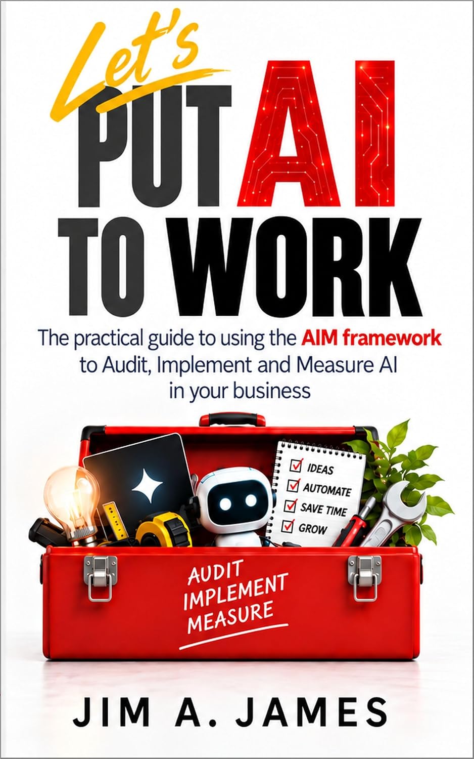
Jim A. James is an entrepreneur, business consultant and host of The UnNoticed Entrepreneur podcast. His book, Let's Put AI To Work, introduces the AIM framework — Audit, Implement and Measure — to help business owners use artificial intelligence to achieve measurable results.